目次
概要
グラデーションテキストはbackground-clip:text;で実装する方法が主流です。
多くの場合それで良いですが、一文字ずつ動かすときにChromeでうまく動きません。
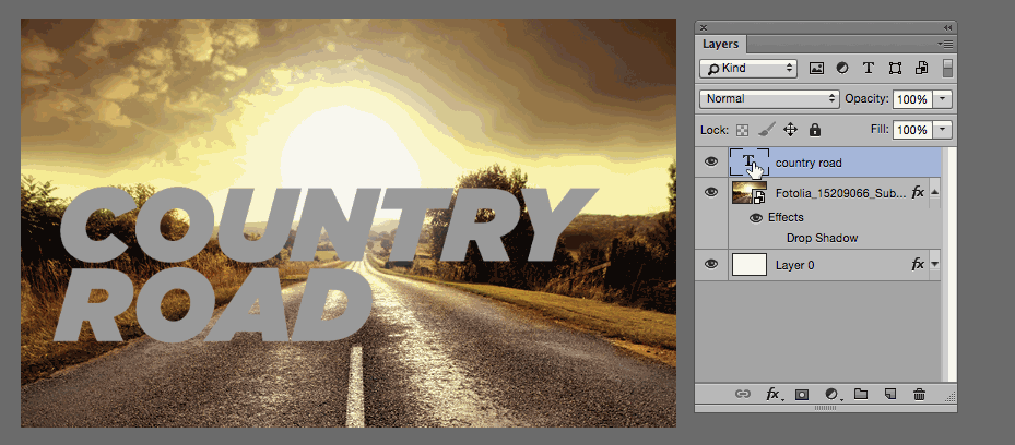
以下は、グラデーションテキストのままアニメーションしてほしいのですが、各文字のアニメーション終了後にbackground-clip:text;が適用されています。↓
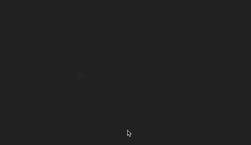
このようにうまく動かない場合があり、解決方法がないか調べてみたところ、mix-blend-modeを使って実装する方法を学んだため記事にしています。
実装方法
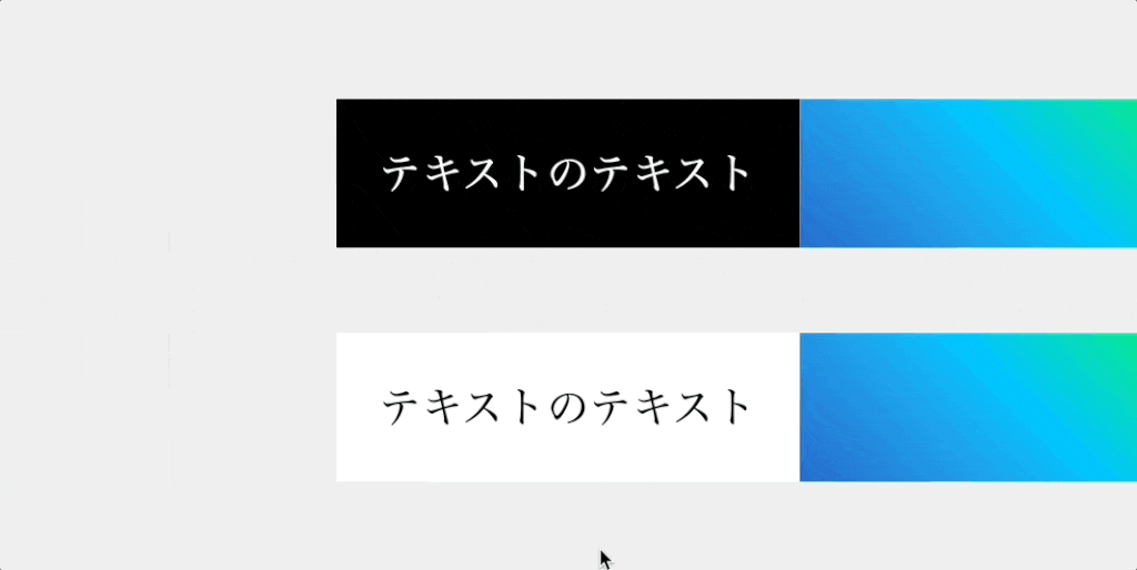
背景色が「暗いor明るい」場合のサンプルを用意しました↓
See the Pen Untitled by ユイト (@mikiprogram) on CodePen.
背景色が暗い場合のポイント↓
.gradation-textのcolorに#fff、background-colorに#000を指定する。.gradation-textの擬似要素にグラデーション用のbackground-imageを指定し、mix-blend-mode:multiply;を指定する。
背景色が明るい場合のポイント↓
.gradation-textのcolorに#000、background-colorに#fffを指定する。.gradation-textの擬似要素にグラデーション用のbackground-imageを指定し、mix-blend-mode:screen;を指定する。
両方に共通するポイント↓
- 疑似要素に
pointer-events: none;を指定し、テキスト選択やクリックを可能にする。1
ポイントは以上です。
一応ブレンドの様子を載せておきます↓
この方法を使えば概要で説明した一文字ずつ動かすアニメーションも問題なく行えます。
以下にデモを用意しましたので、確認してみてください↓
See the Pen Gradation Text With mix-blend-mode by ユイト (@mikiprogram) on CodePen.
参考
あわせて読みたい
CSS-Tricks

How To Do Knockout Text | CSS-Tricks
There are a couple of ways to do knockout text (text that appears cut out, such that you can see a background behind it) on the web. There is one fairly new
ICS MEDIA
CSSのブレンドモードが素敵! mix-blend-modeを使いこなそう – ICS MEDIA
mix-blend-modeというCSSのプロパティ。これはDOM要素を重ねた時の見え方を指定するCSSプロパティです。デザイナー視点だとブレンドモードはごく当たり前に使う機能のひと…
脚注
- 疑似要素の重なり順が「テキストのテキスト」より上のため。詳しくは、z-indexなしの重ね合わせの記事を参照 ↩︎